VITAL STATS
| Certification Status | Petal Certified |
| Version of LBC | 3.1 |
| Location | Portland, OR, USA |
| Project Area | 7,500 SF |
| Start of Occupancy | November 2019 |
| Owner Occupied | Yes |
| Number of Occupants | 50 |
PROJECT TEAM
| Building Owner | Capstone Partners LLC |
| Tenant Owner | Mahlum Architects (Seattle) |
| Architect | Mahlum Architects (Portland) |
| General Contractor | Perlo Construction |
| Structural Engineer | Froelich Engineers |
| Lighting | Biella Lighting Design |
| Telecom, Security, & Audio/Visual | Interface Engineering |
| Electrical | Stoner Electric Group |
| Acoustical Engineer | A3 Acoustics, LLP |
| Door Hardware | Allegion, PLC |
| Technology | ISOutsource |
| Systems Furniture | QuarterTwenty LLC |
| Mechanical | Gohman Mechanical |
PLACE PETAL
01. LIMITS TO GROWTH
Mahlum’s previous Portland location was in a multi-story unreinforced masonry building with inequitable workspace locations. One of the most important reasons for the office move was to ensure employee health (daylighting/indoor air quality) & resiliency (seismic event). The team selected an existing single story timber structure that had a past life as a metal stamping facility because they felt that by occupying a building which preserved the history of the city and banked a ton of embodied carbon aligned with their values more than a location in new construction. The new location has been seismically upgraded to current codes and fully sprinklered as part of a whole block redevelopment project.
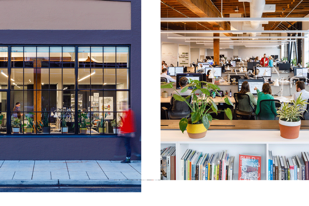
The staff expressed a strong desire for a direct street connection, which was surprisingly difficult to find. A street level connection has been part of the culture of the office for twenty years and maintaining a strong linkage to the surrounding neighborhood was a non-negotiable characteristic of site selection.
Moving into a changing neighborhood, the staff are excited by their role in community building. Occupying one quarter block at sidewalk grade, they consciously programmed a 1,000 SF community room flooded with natural light and flexible for all types of events, which is intended to be available for small non-for-profits on evenings and weekends as a meeting space.
They also insisted that the site earn high mobility scores. Walk Score: 94, Transit Score: 71, Bike Score: 100 while also easing the commute time on the most staff . Because 62% of the employees bike to work, the site needed the provision for interior bicycle parking and shower facilities, both of which were available in the shared tenant amenities provided by the developer.
03. HABITAT EXCHANGE IMPERATIVE
The project team believed that even for a tenant improvement renovation project, the impacts of land use and material sourcing are real and cannot be trivialized. This is evident in understanding the calculation of a materials embodied carbon and resource flows and considering a true-life cycle impact for all project decisions made and their downstream effects. The team began their research into Habitat Offset programs with the goal of finding an organization and project aligning with the larger Mahlum vision of conservation and preservation of a sustainable ecology.
The project team diligently researched and connected with over fifteen different Land Trust Accredited organizations, realizing that finding a value-aligned organization in their relatively local community, with an active land purchase underway at the project scale minimum (1-acre) was a tall order. Part of the discovery process with the Land Trust organizations was in educating and advocating for the Living Building Challenge program. Some of these groups were aware, but many were eager to learn about the program.
During this process, the team also learned that several of the local Land Trusts prioritized a need for stewardship funds (in lieu of smaller new acquisition donations), to help maintain the properties already secured. Several of the Land Trust organizations researched during the project were also making the hard decision to maintain or relinquish their current status.
In the end, the best alignment for the project was to utilize the ILFI Habitat Exchange program, given the ability to pool this project’s impact with other projects.
MATERIALS PETAL
10. RED LIST IMPERATIVE
Compliance with this imperative is demonstrated by providing transparency of ingredients. This can be a herculean effort for building products, to understand and disclose 100% of complex supply chain information, down to very small amounts. We spent as much time on large cost materials as small ones.
One of the biggest challenges with Red List vetting was the Lighting Fixture package. The design consultant had some experience with LBC and helped to put together a package that the team thought would pass muster. They believed that that majority of the manufacturers were willing to meet the disclosure, but quickly found out that they could not meet this commitment. They had to re-specify all the light fixtures based on piece meal disclosures. In the end, the change resulted in a minor cost add, but the schedule was affected.
The other large hurdle was the electrical wiring. Even though their specification said no Red List, the team found the subcontractor bid MC cable which contains PVC. In fact, only a tiny portion of wiring is Declare. After a lot of back and forth with cable companies, asking for transparency, cost, timing, the substitutions were rampant, and PVC kept turning up. A lot of effort and time was spent to get the right wiring. The bill of materials needed to be created by the team.
They had to find a wood finish that was durable (water resistant for a kitchenette) but also Red List compliant. Their decision was to use a “healthier” product with a shorter life span, relying on additional maintenance for the life of our lease. Even with very little glazing it took many months to track down 100% of ingredients and Red List confirmation. The learning curve was very steep on understanding Plywood systems and formaldehyde testing criteria, especially the NAUF / ULEF / NAF differences.
11. EMBODIED CARBON FOOTPRINT IMPERATIVE
The scale of the project is relatively small, which allowed the team to perform a detailed carbon footprint analysis using the Tally plug-in application software for Revit. Tally allowed us to map LCA impacts directly to three-dimensional quantities being modeled by the design team.
The team established an overall embodied carbon budget for the project using the simple web-based Build Carbon Neutral tool to estimate this at 173 mT CO2e; or an equivalent of 86.5 mT, using the 50% methodology rule of thumb. During design documentation and construction, we referenced this original budget against our subsequently more robust Tally analysis, and then into actual product procurement via EPD = Environmental Product Declaration (EPD) review as a Quality Control measure. The team was assured to find that this original budget was relatively close to our final LCA accounting. Their approach to achieve this performance was to balance carbon reductions with all attributes (sometimes at odds with each other) of the Materials Petal.
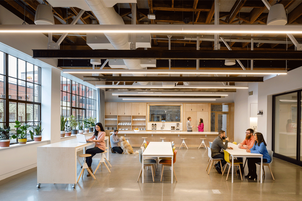
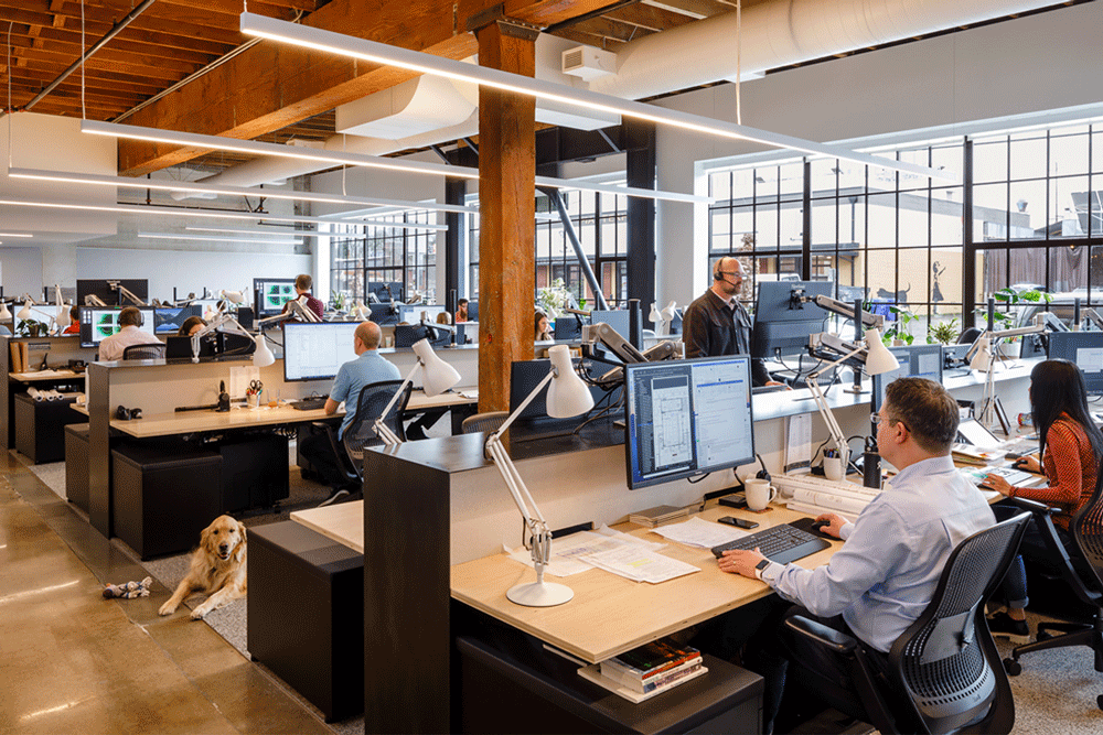
The first big design decision was to select a project site that was a renovation in lieu of new construction. The second decision was to reduce or eliminate materials and finishes. They left the wood roof deck exposed as the finished ceiling and maintained as much of existing concrete slab as possible. They also embraced salvaged materials, even for scope typically outside the traditional LBC boundary (temporary enclosures, etc). Located in the Pacific Northwest, wood was their primary low carbon building material and they used it from structure to finish. They also considered end-of-life scenarios and favored products that more fully embrace a circular economy mode. The team also specified locally sourced products (lower transportation) whenever possible creating synergies with I12 Responsible Industry.
12. RESPONSIBLE INDUSTRY IMPERATIVE
The team leveraged their close relationships with product representatives for access to the best solutions. For the project specifications, the team provided the contractor a way to leverage a prioritized list of sourcing options for both Declare and FSC sourcing.
The carpet for example, was not yet commercially available, yet was Living Product Challenge Certified, and compliant with SF Approved guidelines. Because of their close relationship with the Representative, they were alerted to the product early and specified it.
Most notably, Terry Campbell at Sustainable Northwest Woods (SNW) helped the team achieve project FSC requirements by working through complicated design and procurement issues. The decorative hardwood plywood was one area that was of particular challenge.
FSC chain of custody certification was an initial challenge for small subcontractors doing custom work, so the team leveraged their relationship with Sustainable Northwest Woods (SNW), a distributor of FSC wood to be the umbrella organization for the local FSC Group chain of custody program. All fabricators ordered their commodity wood through them. SNW provided FSC required training to Quarter Twenty (workstations), Market Contractor (casework & finish carpentry), and Willow Classic Woodworking (custom front door) to ensure compliance with COC regulations. SNW facilitated this entire process. Because of the project, three more organizations are now FSC COC certified.
Notable Declare Products used:
- Collins Pine Free Form Particle Board
- Cambria Quartz
- Rockwool Cavity Rock Insulation
- Thermafiber Mineral Wool Insulation FF – Unfaced
- Vaproshield Wrapshield SA
- Oregon Door NAF Particleboard Door
- Kawneer Trifab 451T Storefront
- Schlage L9000 Series Lockset
- USG Sheetrock Brand EcoSmart Panel Firecode
- USG Sheetrock Brand EcoSmart Panel Mold Tough
- Tandus Centiva ethos Modular Carpet Tile
- Autex Sordino Wall Panels
- fSorb Ceiling Panels
- ECOS Interior Woodshield Satin Varnish
- IdeaPaint PRO Whiteboard Coating
- Forbo Bulletin Board
- Mechoshade 5 Manual Roller Shade
- Superior Essex CAT 6 with FEP Jacket
After selecting a Declare Red List Compliant faucet (AEF-3XX Electronic Faucet; AMT-3001), the team learned that it was only vetted to an un-finished condition. They then worked with both the plating finisher and sustainability contacts at the powder coating manufacturer to vet a Red List free finish which is now available to all teams pursuing LBC. In short, the team did research to vet the coating used so now anyone can spec this faucet and be assured this finish is also Red List Free.
All projects must use, at a minimum, one Declare product for every 500 square meters of gross building area. For a project this size that would require the use of only 2 Declare label products. The team used 32.
13. LIVING ECONOMY SOURCING IMPERATIVE
The design team was located within 2 miles of the project site, and we intentionally selected consultants and contractors also within the local Portland area. The local contractor worked with us in a regional approach to finalizing product selections, when options were permissible. One notable example, they suggested using a new (Mahlum & Perlo’s first use of) USG Sheetrock EcoSmart drywall manufactured in Rainier, OR that is not only hyper local (manufactured < 70 km from the site), but also Declare Red List Free, and a lower CO2e product (25% reduction from average) and one of the largest single cost items in the project. It has now become the GWB of choice in other Mahlum projects and is the basis of design in their office master specification. The subcontractor was interested in using because it is lighter (less labor cost) and was cost neutral to the project.
The FSC wood is hyper local as well. The result is that the contractor and their subcontractors now have working experience with local sourcing of sustainable products and are ready to do their next project in a more successful way.
Custom fabrication for the project was selected locally – QuarterTwenty workstations, Willow Classic Woodworking are both good examples.
When specified products were available from numerous locations, the team worked diligently with the contractor and product reps to confirm they could be sourced from the closest proximity to the project site.
14. NET POSITIVE WASTE IMPERATIVE
In design, the team considered what items they could use as salvaged material. For instance, they sourced the Doug Fir cladding (used for wall paneling, casework and doors) from Fort Vancouver (via Salvage Works – a local Portland company), reused the gently worn tenant doors and relites to the shared hallway (in a new location) and salvaged existing steel I-beams original to the stamping facility and re-purposed them for art and presentation supports in the community room.
The team also focused on removing superfluous finish materials whenever possible, unless critical to the project. For instance, existing concrete floors were polished and sealed, and left exposed in most locations and they left the existing wood roof structure exposed throughout. Decorative cabinet hardware was eliminated by designing doors with slots that could be used for opening.
The team endeavored to divert all construction waste from the landfill, writing stringent requirements into the procurement documents. Numerous categories of materials achieved a perfect 100% diversion rate, including metal, paper & cardboard, soil & biomass, and foam / carpet / insulation. Demolition debris was also carefully sorted and recycled by the contractor. During construction, on-site personnel inquired about providing an additional service for composting for food waste. The building manager didn’t have it lined up for the building as a whole so when they asked for it to be added for the construction workers this shifted their thinking and got it up and running so that all the food waste did not go to the landfill. This site composting was made available to other building occupants as well at that time.
The contractor was a great ally, suggesting additional opportunities for salvaged goods to incorporate into the project. This included the temporary protection, recycled from another recent project in lieu of purchasing new materials.
Identification of salvage opportunities – beyond purchasing the locally salvaged wood, the team catalogued each different type of salvage material for the project; existing items salvaged in-place or repurposed, purchased salvage materials, system furniture items moved from previous office location (task chairs, conference room tables, etc) and also items salvaged and transmitted/donated to the Owner for future use in maintenance in the overall building (door hardware, window parts) and diverted from the waste stream.
The team also adopted a “zero waste” mentality leaving our old office space by extensive cataloging of all materials and equipment (not just LBC-wise) during programming, for them to either re-use, recycle or rehome.
EQUITY PETAL
17. EQUITABLE INVESTMENT IMPERATIVE
Mahlum has a rich history of supporting community partners through charitable giving. This was first formalized as their Commitment to Community initiative; and officially elevated within their strategic vision in 2015. Their Commitment to Community programs include a donation of 1% for Architectural Services, an employee match program (both hours and money), and an overall charitable contribution program designated from company profits. Through these programs Mahlum can target specific organizations and initiatives that align with our company’s values, while also allowing them to support organizations that align with employees’ personal values (through the match program).
Our equitable investment far exceeds the charitable donation requirements of imperative I17-3, due to Mahlum’s business-as-usual practices. For I-17 Equitable Investment documentation, they have highlighted 12 donations in 2019 to local, community-based 501c3 non-profit organizations that best exemplify their project and overall firm values:
- All Hands Raised
- Design In Public
- Seattle Block Project
- Health Product Declaration Collaborative (HPDC)
- ACE Mentor Program
- Food Lifeline
- p:ear
- Arts Corp
- Washington Green Schools
- Oregon Food Bank
- The Black United Fund of Oregon
- Arcade NW Architectural League
BEAUTY PETAL
19. BEAUTY & SPIRIT IMPERATIVE
Celebrating Design that Uplifts the Human Spirit Beauty has the power to enrich our lives and the larger community. The Living Building Challenge asks us to celebrate beauty throughout the overall project design, and to incorporate public art. The three examples outlined below – Ceramic Vessels, Curio Cabinet and Infrastructure for the Community – strive to uphold the spirit of the Living Building Challenge.
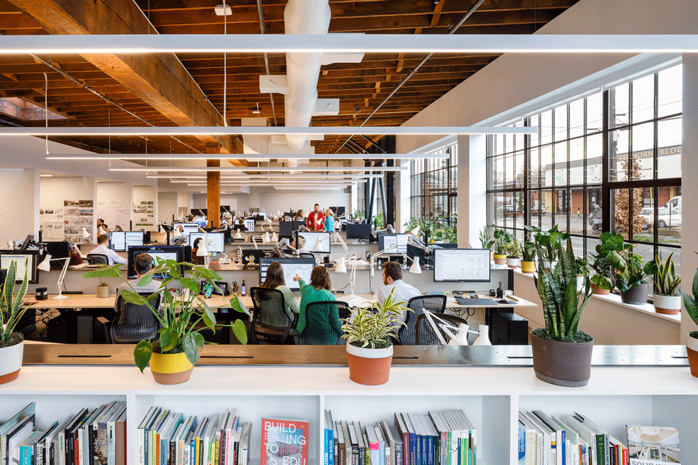
CERAMIC VESSELS with vision glazing of the existing building comprising nearly 50% of our exterior walls, abundant daylight is a refreshing change from our previous office space. While this is a welcome feature, this new wealth of daylight and views has brought on a new and interesting design challenge to the project team. How can we both celebrate this new bounty of sunlight as well as provide a sense of security and privacy from those passing along our building?
Providing a visual screen between the workstations and the sidewalk became an essential component to providing a safe and secure working environment. The effort to provide safety and security quickly became an opportunity, one that incorporated art, biophilia and community.
Weary of installing film on the glazing (which would block 100% of the views to the outside), plants strike the right balance of creating a sense of security while not eliminating views completely. Using plants as a screening element both helps with our visibility concerns and creates an opportunity to engage with the art community in the creation of custom ceramic pots.
Mahlum engaged a local neighborhood ceramic artist, Paige Wright, and commissioned the creation of ceramic vessels. Paige collaborated closely with the design team to throw pots that fit within the new office aesthetic. Simple shapes and glazing ratios were chosen to express the variety in clay types: light brown, red and chocolate. These natural tones play in contrast to the bright yellow and white glazes. With 3 vessel sizes, 4 vessel shapes, 3 glazing choices, and 5 varieties of plants, a wonderful mix of color and texture liven up the workstation studio.
Plants in the office environment also provide human physiological benefits. In biophilic design terms, the added vegetation achieves the following:
- Light and Space – Filtered and Diffuse Light: Varying sizes and shapes of plants add a textural layer that dapples the light, creating visual intrigue.
- Light and Space – Views and Vistas: With 120’ feet of windowsill, views to the outside from nearly any part of the office includes the plants and the hand-crafted ceramic pots in which they reside. • Light and Space – Light and Shadow: Shadows change and evolve throughout the day.
- Evolved Human-Nature Relationships: Screening provides a sense of protection and privacy from a busy street.
- Indoor Air Quality: Sansaveria Laurentii (snake plant) is especially good at purifying the air, removing toxins such as formaldehyde, xylene and nitrogen oxides
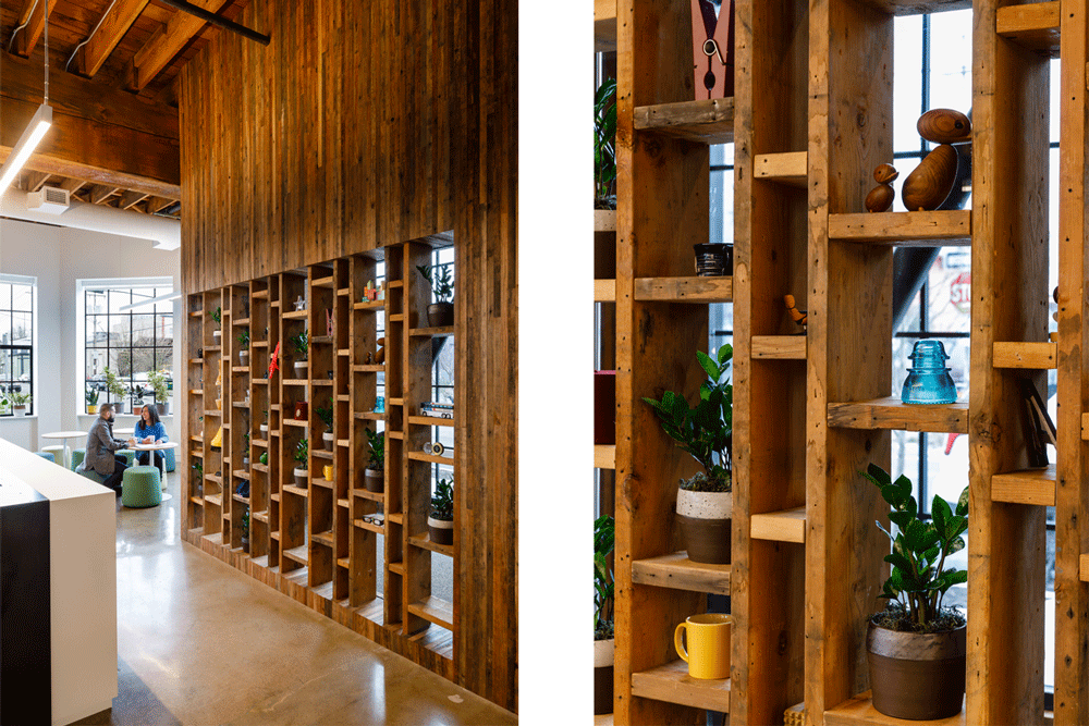
CURIO CABINET The entry sequence is an important element to the design of our new office. Opening the door to a space is the first interaction one has with our building, we wanted this to feel human and celebrate a sense of place. Locally salvaged wood was chosen for the cladding and steel was chosen for the door pulls. Each element expressing the passing of time in their own unique way, salvaged wood rendering a storied history of Oregon’s past and the oiled steel door-pulls forecasting the promise of patina.
Oregon has a rich history of wood structures built out of Douglas Fir, including the building we now occupy. It felt natural to feature this material at our new entry. Working with Salvage Works, we were able to acquire old growth Doug Fir tongue and groove floorboards once used at Fort Vancouver (originally constructed in the 1930’s). We shared 2/3 of each board with another project in Portland and milled down each 3” piece to 1.5” in width.
Careful study of the openness/visual safety of our entry revealed a want for screening. A playful, organic shelving system was designed to appear as if carved out of the monolithic vestibule. This shelving system, affectionately called the curio cabinet, will house small tokens from each staff member. This curio cabinet is a playful expression of us at the front door, there to greet each visitor as they pass through our vestibule.
The Curio Cabinet is an expression of our values, an offering of us to the public. It is our hope that the community space is a forum for dialogue, and a good dialogue begins with openness and trust, the foundations of that lay bare at our entry.
INFRASTRUCTURE FOR THE COMMUNITY In the early stages of programming, the design team dedicated over 1,000 sf of project area to a flexible community space. This area is intended to be our living room, our dining room, our kitchen, and our home. It is here where we will invite our neighbors, our friends and the community at large to gather, break bread and share ideas. We wanted this area to be beautiful, exemplify our values, and be flexible to support a multitude of needs. To avoid constraining the space’s use, we chose to utilize the height of the space by suspending structural beams from reinforced roof joists. The steel beams chosen for this purpose were salvaged and reused from the project site.
We inhabit a space that has a past life as a metal stamping facility. In order to move large items around this space, steel ‘I’ beams were mounted to the existing timber structure. These steel beams were still suspended when we signed our lease, and then inspired the current installation we see in the community area. Steel beams, once used through the 70’s, 80’s and 90’s to transport heavy objects have been relocated, re-sized and re-purposed to provide a flexible system that allows users to suspend presentations, art, lighting and space defining partitions.
Further, the area above our reception entry has been structurally reinforced for future installations of public art. Together, the community space and reception represent our commitment to supporting our neighbors.
LOOKING FORWARD The Living Building Challenge opened our eyes to many truths. One that resonates strongly through the Beauty Petal, and that will hopefully find its place in our projects moving forward, is collaboration. Each of these three examples on how we approached Beauty on this project were steeped in connections, connections to the Portland community and to the history of the Portland area. It is important to embrace Beauty in our projects, not just for beauty sake, but for the richness in value it can provide.
20. INSPIRATION & EDUCATION IMPERATIVE
Annual Open Day: Each spring Portland holds their 2020 Design Week Portland, built on the strength of hundreds of independent Events and Open Houses, conceived and hosted by the creative community of an entire city. As a participant in this program, we have scheduled an Open House in our space this April 24th, specifically crafted to invite visitors to learn about and explore the materials that were chosen to comply with the strict requirements of the LBC Materials Petal. To support this, we will have our contractor, subcontractors, and suppliers available at tables to answer questions about materials and installations. And finally, Jay Hindmarsh will give two informational talks on material transparency, one at 5 pm and one at 6 pm. We see this Design Week Festival as an opportunity each year to open our doors and share knowledge and expertise with our design community.
Educational Website: Our company website contains a project page for our new Portland office which includes our version of the case study.
The O&M plan: A requirement of the project specifications, the contractor provided an Operations & Maintenance instruction for all materials used on the project.
Brochure & Interpretive Signage: As most of our project information is available on-line, a small brochure of the space with plan will be available to visitors to orient themselves to the office and will be used primarily on open house days. We have crafted interpretive signage placed in three locations in our office to explain the most unique and interesting aspects of the design to visitors; Place, Equity, and Materials. Materials will be the most highly featured display with material samples used in the project available to pick up and handle. The intention is for this area to be used by teams as they develop projects. Teams are invited to add materials to the area when they become available as a physical repository, acting as an extension of our Materials Transparency Practice Guide
